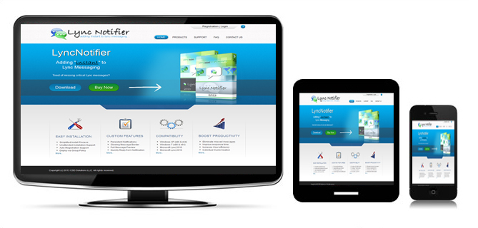
Get Responsive
Responsive websites means your web pages will seamlessly display great on a Desktop PC, a Tablet device as well as on all Smartphones.
Mobile traffic now accounts for more than half of total internet traffic so if your web site is not yet responsive, you’re missing out on a lot of traffic! This trend is so prevalent that Google has begun to boost the ratings of sites that are mobile friendly if the search was made from a mobile device. This has the net effect of penalizing sites that are not mobile friendly.

As the demand increases for businesses to share their data to mobile devices responsive web design has become important. We securely surface your business data in responsive pages using a framework such as Bootstrap or Semantic-UI in conjunction with custom built .NET, PHP or Amazon Web Services.
Extending your custom data to your mobile customers is easier and more affordable then you think! Contact us for more information.
Responsive Frameworks We Use
Semantic UI – ‘Buttery Smooth’
Semantic UI is a modern front-end development framework, powered by LESS and jQuery. It has a sleek, subtle, and flat design look that provides a lightweight user experience. According to the Semantic UI website, the goal of the framework is to empower designers and developers “by creating a language for sharing UI”
Bootstrap
Bootstrap is the most popular HTML, CSS, and JS framework for developing custom responsive, mobile first projects on the web. We’ve been using this framework since 2013 to develop and deliver some pretty slick stuff. One codebase really can do it all! More..
